Design principles for reducing cognitive load

We’re bombarded with content every day and, with the average human attention span now less than a goldfish’s, easing the cognitive load is essential when creating content.
Written by
Nichola Hudson
Published on
January 12, 2021
Design principles for reducing cognitive load

We all have a limited degree of concentration. And it’s never been harder to capture the user’s attention in a world flooded with content. So, it’s more important than ever to make sure that your platform’s content is easily digestible to hold your customers’ attention long enough for them to take the action you want them to. In this article I’ll look at how we can ease the cognitive load on users and explain the impact that this could have on your success metrics.

What is cognitive load, and why is it important?

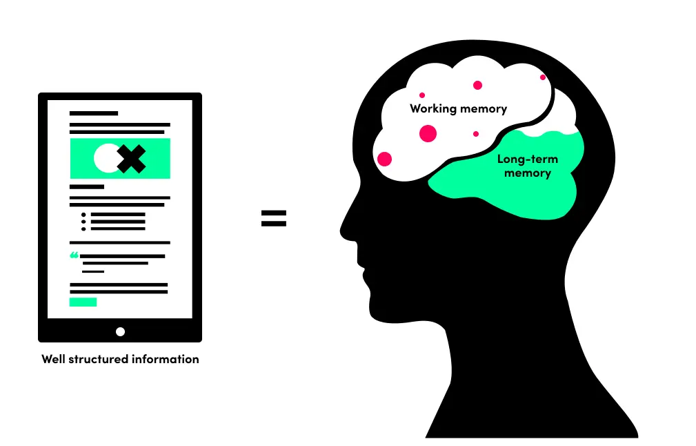
When designing content, we need to keep in mind that one of the most important things is to ease our users’ cognitive load. But what exactly is cognitive load? In short, cognitive load refers to the used amount of working memory, the information that our brains manipulate at that moment. The human memory can be divided into working memory and long-term memory. Processing new information results in ‘cognitive load’ on the working memory which affects learning outcomes. Easing the cognitive load for your users when reading content means that they’ll easily process that new information.

Thanks to technology, the average attention span of a human is lower than ever at 8.25 seconds. When you compare that with the average attention span of a goldfish, which is nine seconds, you’ll see that there isn’t much time at all to capture the attention of your user and keep them engaged with your content.

Twenty to twenty-five years ago, we were more likely to source our information from reading books. Books give us a tangible method of placing where we are within the content of their physical pages. Screens and e-readers fail to recreate tactile reading experiences on paper, preventing people from comprehensively navigating long texts. Screens also drain more of our mental resources, making it harder to remember what we read when we are done.

People generally spend an average of three hours and 15 minutes on their phones every day being bombarded with information from multiple different platforms. Compare this to 20-25 years ago when the internet wasn’t as easily accessible. We now have access to millions if not billions of pieces of information literally at our fingertips, meaning that reducing cognitive load is a top consideration for designers.

And now that we're in post-pandemic recovery and experiencing an economic crisis where we're seeing the cost of living soar, record numbers of people are experiencing stress in their jobs and personal lives, meaning reducing the cognitive load is more important than ever. A collaboration between Toptal and Yerbo's psychologists explains how UX designers should be aware of reducing cognitive load to ease burnout, stress and other threats to users' mental health.

Content principles to help ease the cognitive load

Copy

Considering the written element of your content – the copy – on the page and how it’s formatted will help with the page’s visual hierarchy, making the information easier to take in.

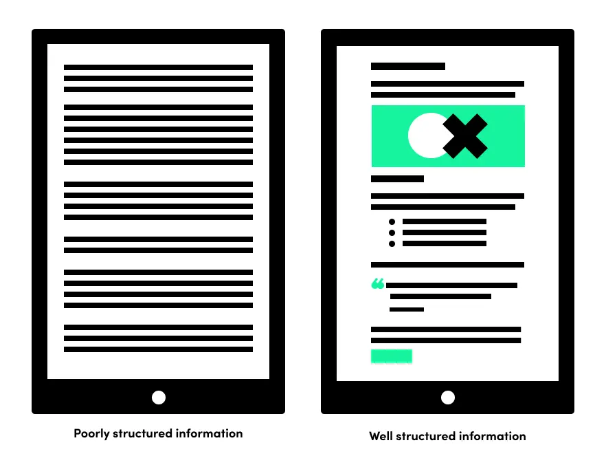
  • Headings and subheadings – one long block of copy is draining so using headings and subheadings are fundamental. They’re used to explain what’s in the following paragraph, so the user can locate information quickly and refer back to information when needed. It helps to break the content on the page up into sections, making the information easily digestible, and giving the reader the option to scan to the parts they’re most interested in.
  • Short sentences – when it comes to sentences less is more. Most people skim read and keeping sentences short (around 12 words or so) gives your users the best chance of reading your article and digesting the information within. One technique for making sure your sentences are short and punchy is to read your words out loud. If you’re taking too many breaths when you read then the sentence is too long.
  • Small paragraphs – a sentence above three lines long should take the form of a short paragraph. It’s recommended that a paragraph is no more than 150 words in three to eight sentences.
  • Use plain English – wherever possible and if it’s within keeping of your tone of voice guidelines. Look for long or formal words that can be shortened, keeping the content and tone clear. For example, ‘buy’ instead of ‘purchase’, ‘so’ not ‘in order to’ and ‘but’ rather than ‘however’.

Imagery

Relevant images and infographics can help the user digest and understand complex content. Presenting content visually can attract those who wouldn’t usually be drawn to that particular content. Infographics are effective when used for the right purpose.

  • Infographics, making the complex simple – if done well, infographics are extremely useful at telling all the information a user needs to know without having to read a long piece of copy. They’re easy to digest because they combine the written word with visual elements to pack big ideas into small spaces and are considered one of the best ways to increase engagement. Our friends at Visme have created a comprehensive guide to creating infographics, so you can start making your own.
  • Images that tell a story – images help create a moment to pause in your content, a visual break between words, and help emphasise your point. Including a relevant image will help the user to understand and engage more with what you’re saying. Choosing the right images for your content is important. Make sure that the quality of the images is good, the context of the images relates to your written content, and try and avoid cliché images. We’ve all seen two hands shaking before.
  • It’s a balancing act – yes, images and infographics are great ways to help your user digest information and keep their attention. Still, too many can overstimulate them and cause loss of focus and distraction. Ask yourself – how is this image/infographic helping the user digest my content? If you haven’t got a good answer then leave the image out.

Layout

The main objective of any page layout is to communicate information as clearly and effectively as possible. As humans, our brain process visuals better than text, so with that in mind, a good page composition is going to help your reader consume the information.

Considering the layout of your content will help structure it in a way that the user can flow through the page and take in key points of information.
  • The power of the grid – one way to ensure your page is balanced and easy to read is by using a grid. A grid gives you the ability to provide a sense of order to your layout, creating a clear structure.
  • White space is your friend – when used wisely, white space is a great way to let your content breathe. It helps the user digest the information without being overwhelmed with the amount of content on the page. But take care – too much white space can create a disconnect between user and content.
  • Visual and information hierarchy – pulling out an important piece of content makes sure that the user is presented with the key points that you want to provide, giving them no way of missing it. This can be done with many different techniques:
  • pull-quotes
  • call-to-actions (CTAs)
  • images
  • infographics
  • content sliders
  • consistent structure
  • use of fonts

Bullet points and lists

As you might have noticed by now, parts of this article is formatted using an unordered list. Bullet points and numbered lists help separate content into relevant sections and make for easier reading, you naturally notice them more. And so you’re likely to pay more attention to it.

  • Numbered or unordered lists? – using the correct list formatting helps to break down content in a relevant way. We only tend to use numbered lists when the order of the content is important; like a top 10 list, or steps to follow. Unordered lists (bullet points) are used when the order of the content isn’t relevant.
  • List structure – considering the structure of your list will help the user to digest the information easily. Introducing your lists (the lead-in) helps to add context to the following list and why it is important.

People consume content in different ways. Some like pictures and others may prefer text. But the one thing everyone has in common is a shortage of time and attention span. If you follow the above principles when creating your content, you’ll help reduce your reader’s cognitive load. As a result, your users will be able to process your information easily, hit key points of your content and ultimately convert.

If you’d like help with your digital marketing and content strategy, get in touch with us today.
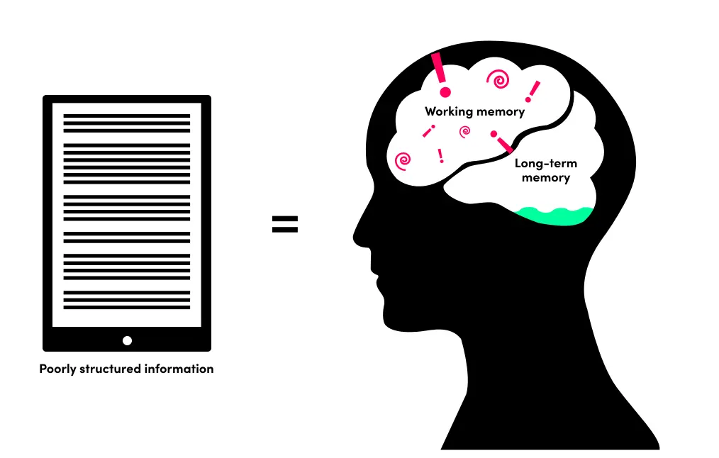
Image of high cognitive load
Image of low cognitive load
No items found.
Image comparing high vs. low cognitive load
No items found.
No items found.

Contents

Regular newsletter
Our latest thoughts, tips and exclusive interviews in your inbox every month.