

Membership organisations are all about attracting new members and retaining existing ones, so engagement is top of the list when it comes to membership websites. What does this look like in the form of good UX? We’ll explore some membership organisation websites to show you some examples of good UX and where improvements can be made.
Making the online experience for any site as seamless as possible for the user is key to its success. And there’s the added impact of COVID-19 – with everyone turning to digital for their needs – making creating a great user experience more important than ever.
Even when the pandemic is behind us, the accelerated use of digital has given us an insight into the future. With Generation Z being the next wave of members entering the employment market (the first generation that’s grown up with digital), membership organisations will need to build their online presence and make sure that their users get the best experience possible.
Mobile is already, and will be increasingly, the most used device when it comes to searching the web. Making sure that the user journey on mobile isn’t neglected or is tackled as a last resort is vital for the optimisation of membership sites.
User journeys on mobile can be more complex than on desktop. This is due to many factors, one of which is the lack of space. It’s easy to leave the mobile journey till last and prioritise desktop, but you’ll find that in some cases, if you can make the user journey great on mobile then it will transition over to desktop easily.
Membership organisations shouldn’t underestimate just how powerful great UX is in their overall membership experience and so need to plan ahead for this. Creating a personalised and engaging UX is a great starting point that not only makes your site perform for your existing members but goes a long way in helping you attract new ones too.
With member engagement and acquisition top of the priority list for the membership and association sector, here are some great examples of membership sites where the acquisition journey is clear on desktop and, in most cases, mobile.
The British Medical Association (BMA) is the trade union and professional body for doctors in the UK. BMA has a clean look and feel to their site which is consistent throughout, creating easy to navigation pages and content.
When the user lands on BMA’s homepage they’re first met with a slider with a ‘Join us’ CTA (call to action). This gives the user a clear prompt to start on the join us process, reading more about member benefits, cost, ways to join, FAQs, and more. This same CTA is in the navigation bar too. These clear CTAs navigate the user to key information within one click from landing on the homepage and from there to the registration process.
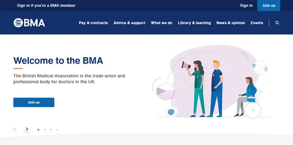
The content on the BMA homepage is targeted at the current member, linking them off to different keys pages, displaying news and events.
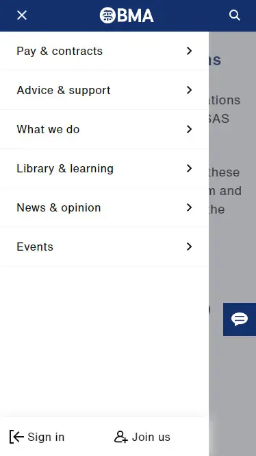
Throughout the BMA site you’ll find that the mobile journey is mostly consistent with desktop. We get the feeling that mobile has been considered with all elements on desktop collapsing down to mobile, keeping all the key information available for the user.
That said, as a prospective member viewing on mobile, there isn’t much on the homepage other than the ‘Join us’ CTA button. If the prospective member didn’t see the ‘Join us’ CTA button and navigates to the burger menu, they wouldn’t see the ‘Join us’ CTA that’s on the desktop navigation as it’s hidden in the burger menu. So this mobile user journey could end as the prospective member doesn’t know where to go to gather more information before deciding to join.
To improve the UX for the acquisition journey on the homepage, BMA could introduce a ‘member information’ or ‘member benefits’ section which would lead the user to read more information about the membership. This means that users still in the information gathering stage of their journey can navigate to the correct content for them, whether they’re on mobile or desktop.
The Chartered Institute of Management Accountants (CIMA) is the world’s leading and largest professional body of management accountants.
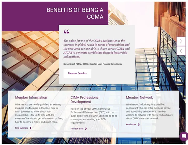
On the CIMA homepage there’s a dedicated member section which includes clear ways to link off and read more about being a member, including current member testimonials. This gives the user that trust element as hearing from other members helps convey the community aspect of a membership organisation.
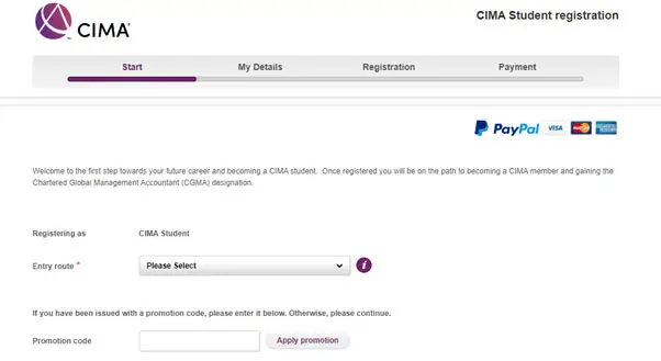
CIMA’s registration process is made clear with a stepper to show the user where they are within the form process. This is a great way to give your user an idea of how long the form might take to complete and the information that they will need to provide along the way.
Improving the general look and feel of the registration process will help to guide your user along without losing their attention.
BCS, The Chartered Institute for IT, is a charity which aims to lead the IT industry through its ethical challenges, support the people who work in the industry, and make IT good for society.
The navigation is clear with links that are easy to understand. Below the hero image on the homepage, the first thing that a user is met with is a very striking green bar with ‘Start your membership journey’. This CTA really catches the user’s attention and helps to lead them to the Become a member page to learn more about the membership.
Following on from that, the user is met with a testimonial section where they can click on different names and see their individual testimonials. Again, the user gets the same benefits from this as the CIMA site - promoting that community feel and trust factor.

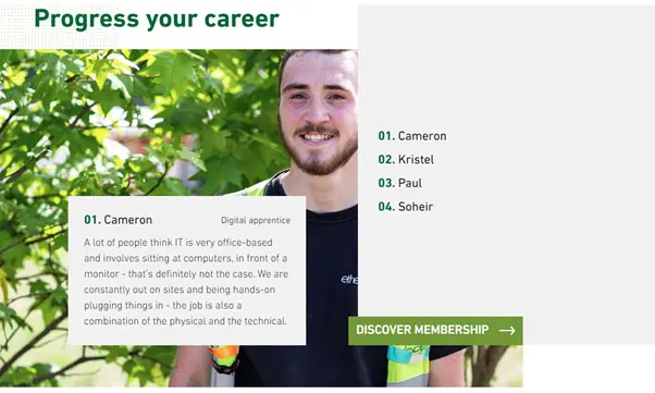

BCS’s homepage is more catered to the new member rather than their current members. We don’t see information about news, events, etc. on the homepage. Instead, the main focus seems to be attracting new members and directing prospective members to the correct places to gain more information before starting the registration process.
When the user is on the ‘Become a member’ page we would expect to see a ‘Register now’ button so that the user can start on their registration process. Instead, the user is met with four options which all take you off to another page with more information. Although this is great for the user to read more information about the membership type that’s suited for them, it makes getting to the actual registration process feel slow and long winded.
By introducing a generic ‘Register now’ button and dealing with the four different types of membership available would mean that they can reduce the amount of friction that they have currently and make the journey a little smoother for users.
The National Education Union (NEU) is the largest education union in Europe.
The homepage is targeted more to current members with the news, key issues and get involved sections, but the prospective member isn’t forgotten.
The ‘Why join?’ link in the navigation is a great way to acknowledge the types of questions a user may have. ‘What’s in it for me?’ is the first question any prospective member has so acknowledging this question in the navigation draws the user’s attention to it immediately. The Why join page helps guide the user to all the information that they need when considering joining - benefits, eligibility, rates, FAQs, etc.
When normally top links tend to be in the burger menu on mobile, NEU has chosen to display Why join? and Get involved, with the other top links being sent to the hamburger menu. In doing so, they've acknowledged what their users need most and created a website with a very member-centric UX.
One suggestion for NEU to further improve the member acquisition journey would be to make the navigation ‘sticky’, meaning the navigation would follow you down the page. That way the ‘Join now’ button in the navigation would always be visible to the user making access to the joining process much easier as there’s no need to scroll back up to the top of each page.
All four of these membership sites across different sectors show distinctive ways to create great UX for members and prospective members on both desktop and mobile.
Carefully considering each user journey – prospective members and existing members – and giving them the information they need quickly, and at the right time, will help increase your acquisition and retention rates.
You can download our Member Journey Mapping Tool to help you map both journeys, assess and improve your membership site.